Jessie Dismorr: a little gallery
 Of all the women Vorticists or associates of Vorticism, Jessie (later Jessica) Dismorr has perhaps received most attention in recent years. But no substantial study has appeared; the definitive reference must be Catherine Heathcock’s 1999 PhD dissertation, but this still sits in the University of Birmingham awaiting a publisher. Beyond references in general treatments of Vorticism, solid information is pretty much limited to Quentin Stevenson’s excellent little biography in the catalogue of the Fine Art Society’s 2000 exhibition of Dismorr and Catherine Giles.
Many questions remain: the nature of her relationship with Wyndham Lewis; the psychological anguish she endured over many years; the abrupt changes in her visual style; the reasons – which must remain a matter of speculation – for her tragic suicide in 1939. Given her recent reputation, it comes as a bit of a surprise to find that so little work from her Vorticist period remains; in fact, relatively little may have been produced in the first place.
Since her work before and after that period is well worth attention, it has made sense to round up as much as I can find from her entire career, simply for the sake of seeing it together. Individual items set into this wider context spark off against each other revealingly. However, this little “gallery” is well short of the total surviving, and I have not attempted a listing of all known works, which would be well beyond me. As further images come along, they will be added. I have divided the work into broad categories in chronological sequence. Image resolution is not always the best, I’m afraid. Where an item is in a public collection, the location is briefly noted in the caption.
Post-Impressionist and Fauvist works, 1911-13
-

-
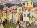
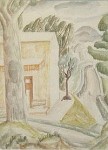
Avignon, 1910
-
-
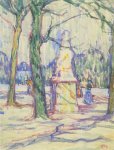
Luxembourg Gardens, c1911
-

-
Sunlight Martigues, 1911
-

-
Martigues Market, 1911
-

-
Night Scene Martigues, 1911-12
-

-
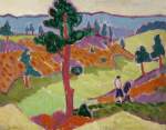
Landscape, Southern France, c1911-12
-
-
Landscape with Figures [Sheffield]
-

-
Landscape with Cottages, c1913 [Government Art Collection]
-
-
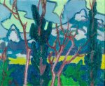
Landscape With Trees, c1911-12 [Government Art Collection]
-

-
The Ruin, Les Baux, c1911
-
-
Les Baux; the Priest Enters his Church, 1911
-

-
Les Baux from the Valley
-
-
Italian Landscape, 1912
-

-
Les Baux, 1912
-

-
In the Garden, 1912
-

-
The Square, exhibited 1914
-
-
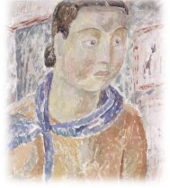
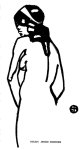
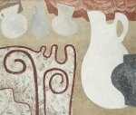
Portrait of a Young Girl, 1913
Except for the watercolour Luxembourg Gardens, these are oils. The influence of Dismorr’s teacher J D Fergusson is clear. A progression can be seen away from exuberant colour and towards more severity of form, perhaps anticipating the Vorticist period. The Portrait was bought by Roger Fry, maybe in validation of his own muddy palette and stolid compositions. The Square was exhibited in 1914, so perhaps painted in 1913.
Drawings for Rhythm, 1911-12
-
-
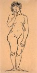
Nude
-
-
‘Rhythm’ 1, 1911
-
-
‘Rhythm’ 1, 1911
-

-
‘Rhythm’ 1, 1911
-

-
Isadora, ‘Rhythm’ 2, 1911
-
-
‘Rhythm’ 3, 1911
-

-
‘Rhythm’ 4, 1912
-

-
‘Rhythm’ 5, 1912
-

-
‘Rhythm’ 11, 1912
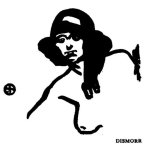
Apart from the undated (and rather Japanese) drawing shown first, which seems to fit here, all these are reproductions published in John Middleton Murry’s literary and arts magazine Rhythm, whose art editor was Fergusson. The house style was a sort of progressive art nouveau, often using the female form as a symbol of natural vitalism, as exemplified by Dismorr’s beautifully competent illustrations and space-fillers. I have included here all named as hers or using her circular “JSD” monogram, together with a couple that appear to be by her. The fluent and confident handling of outline and edge is a strength that runs through much of Dismorr’s work. Commentators have seen in the image of Isadora Duncan an early shift towards the angularity of the Vorticist period.
Vorticist and post-Vorticist works, 1914-1922
-

-
Edinburgh Castle 1914-15 [V&A]
-

-
Abstract Composition, 1915 [Tate]
-

-
Design, ‘Blast’ 2, 1915
-

-
The Engine, ‘Blast’ 2, 1915
-
-
cover, ‘Poems’, 1918
-
-

-
Wyndham Lewis with Cat, c1919
-
-
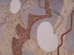
Drawing, Group X catalogue, 1920
-

-
Self Portrait, Group X catalogue, 1920
-
-
Conversation, ‘The Tyro’ 2, 1922
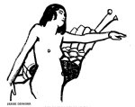
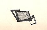
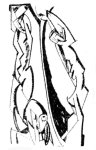
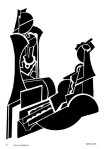
The Tate’s Abstract Composition seems to be Dismorr’s sole surviving Vorticist oil; whatever happened to Movements, the only Dismorr purchased by American collector John Quinn? It’s interesting that Abstract Composition employs unique and tonally modelled solid forms that tumble through space; in this it is atypical of much other Vorticist work. Design and The Engine survive only in reproduction, as do Drawing, Self Portrait and Conversation, in Blast 2, The Group X exhibition catalogue and Lewis’s The Tyro 2, respectively. The figures of Drawing are somewhat Lewisian, while the later Conversation parallels Lewis’s move towards semi-abstract figures incorporating sections of circles. Wyndham Lewis with Cat is a beautifully humane little drawing that belies Lewis’s punchy self image, showing him as tender, domestic, a little chubby and – yes, almost vulnerable. Edinburgh Castle (Dismorr’s title) is unhelpfully listed as Landscape, with no image, in the V&A online catalogue.
How little there is from this important period! But the select group of survivors is perhaps expanded by the other two images shown here – a cover design and a colophonic space filler, both from a hand written collection of Dismorr’s poems given to the American modernist sculptor and printmaker John Storrs, who she met in France. In this “exchange of writings” proposed by Dismorr, she received poems by Storrs, who also in July 1918 gave her one of his woodcuts. (To Storrs, she politely professed an enjoyment of his poems for their “great love of beauty”.) Her collection survives in the Storrs papers in the Smithsonian, where the cover is attributed to him. However, I can’t locate the evidence for this assertion, and the graphic style is so very much compatible with elements of Edinburgh Castle and the two Blast drawings, that for me the probability is with Dismorr’s authorship. The style of lettering is also compatible with Dismorr’s hand – in particular the elongated “S”. (Both Dismorr’s poems of this period and the influence of Vorticism on the work of Storrs might be fruitful topics for another day.)
Landscapes 1921-5
-

-
Collioure, 1921
-
-
Continental Street Scene, 1924
-

-
Lewes, West Sussex, 1925
-
-
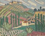
Road to the Hills, Provence
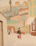
In 1921 Dismorr suffered a major breakdown, which might account for the “safe” approach of this series of pleasant but bland watercolours. In late 1923 she changed her name to Jessica. In 1925 her show at the Mayor Gallery comprised 37 watercolours, all but two landscapes. A series of watercolours of music hall figures from 1924 is not represented here.
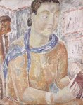
Heads & portraits, 1926-c.1933
-

-
Double Portrait, c1926
-

-
Self Portrait, c1928
-
-
Self Portrait, c1929 [National Portrait Gallery]
-

-
Portrait of Robert Farrant, c1929
-

-
Mrs Ody
-

-
Portrait of a Lady Holding a Book
-

-
Portrait of a Young Girl
-

-
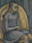
Woman in a Pink Dress
-

-
Mother and Child, c1932
-
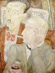
-
Conversation at Cagnes
-

-
Interior
-
-
Young Child
In 1926 Dismorr joined the London Group and the Seven and Five, with both of whom she continued to exhibit. These oils seem to represent a positive change of direction. Some have a touch of the feigned naivety of Christopher Wood, or even a hint of George Grosz, as in Conversation at Cagnes, where the left hand figure must be meant for James Joyce, surely? The undated drawing Young Child is the odd one out here, but is assumed to belong to this phase.
Drawings of poets, 1934-5
-

-
Dylan Thomas
-

-
George Barker
I have already noted these two on one of my George Barker pages. In 1934-5 Dismorr was introduced by Roger Roughton to the up-and-coming poetry scene, and to David Archer’s bookshop; she also made portrait drawings of Roughton, David Gascoyne, John Pudney, A S J Tessimond, Stephen Spender, William Empson, Charles Madge and C Day Lewis. It’s to be hoped that the remainder are better than these two; something of the cherubic Thomas is there, but Barker has been reduced to glossy unrecognisability.
Compositions, 1936-7
-

-
Vases on a Table, 1937
-
-
Greek Vases with Minotaur
These “decorative” compositions are the precursors of the final abstracts; they feature shapes of vases, jugs etc in restricted and neutral colour schemes. Their broad relation to the still lives of Ben Nicholson and others is self evident. Personally, I can’t see any Minotaur.
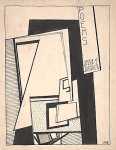
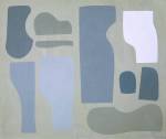
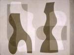
Abstract works, 1936-9
-
-
title unknown
-

-
Two Forms, 1936
-
-
Abstract 1, 1936
-

-
Abstract 2, c1938
-

-
Related Forms, 1936-9 [Arts Council Collection]
-
-
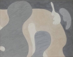
Related Forms
-
-
Related Forms, 1937 [Tate]
-

-
Related Forms, 1937
-

-
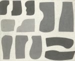
Superimposed Forms, 1938
-
-
Superimposed Forms, 1938 [Birmingham]
For this final phase, Dismorr switched to gouache or tempera. Despite an early suggestion of Arp, the concerns of the “decorative compositions” follow through. The separated forms were tagged by friends as “Jessica’s dress patterns”, which seems a perfectly feasible reference, while the shapes in Superimposed Forms suggest heads and torsos, so that the human figure is never entirely absent. The subtle palettes of browns, beiges and greys hum quietly, and the later, more refined compositions have a strong dignity. At least two of her final compositions were painted in more than one version. In the 2000 Fine Art Society catalogue Abstract 2 is illustrated positioned horizontally. This way round looks right to me.
On 29 August 1939 Jessica Dismorr hanged herself. The reasons suggested seem speculative, though the fear of further breakdown might make sense. One friend suggested that the trigger was the “sacrifice of her own complexity” in these last works – the inevitability of her further movement into abstraction, with the knowledge of its unbearable coldness and de-sensualisation. Instead, death proved her ultimate abstraction.


Our web arts journal http://www.flashpointmag.com has a new essay on Jessie Dismorr by Francesca Brooks. Elsewhere we link to you for Lawrence Atkinson and Helen Saunders because richardawarren.wordpress.com provides such a formidable reference site.
Thanks, Rosalie. I like the ‘formidable’! Useful and interesting piece by Francesca Brooks, which I’ll certainly flag up and link to in a post. The pairing with Virginia Woolf has viability, though a closer comparison might be with Hope Mirrlees’ ‘Paris’ of 1918; the link to Woolf might make more sense via Mirrlees, who could well have read Blast and who knew VW. A couple of decades further on, we could also bring in the flanerie of the British poet Rosemary Tonks, whose inspiration, like Dismorr’s, lay in late French romanticism. Useful discussion of Debord and the derive in this context, though the derive also has its ancestry in Baudelaire etc; psychogeography was always more psycho than geography, and we shouldn’t ignore the strong romantic strand in situationist thought. I’m not quite so convinced by the Epstein bit, but it’s an interesting direction.
I hope my editing of Dismorr’s texts, available on my site, will be a helpful source. I notice that FB’s piece was written without reference to it, hence the persistence of the Blast typesetter’s error of ‘Rodengo’ for ‘Roderigo’. But it’s a small point. The more on Dismorr, the better! Cheers.
Many thanks for this great ‘little’ gallery. So useful to see the evolution of Jessica Dismorr’s style over the years. I have discovered this artist when I bought a painting which I believe is by her. Entitled “Dido” (reference to the Greek mythology). I date it back to 1934-1936. I said “I believe” because experts differ in their opinion: Tate Britain had not doubt about its authenticity, But Mr Steveson rejected it (ah…experts, so many books to be written on authorised experts and foundations in charge of late artists!). I believe it belonged to Robin Ody (there is a reference to him on the back of the painting). Hopefully I can demonstrate that this intriguing oil is hers and give it a new life. And add it to your gallery…?
And many thanks for this. The “gallery” is not much – just whatever I could find, and is a long, long way from anything close to definitive. I’m slightly more proud of my transcripts of her writings, also among my pages. I’ve no contact with Quentin Stevenson. He’s said to have been working on a biography for some years now, but I’m not aware that it’s yet published. A piece in the FT for 2006 (search for ‘The face that launched a thousand questions’ by Mark Archer) mentions Jonathan Ody, son of Robin Ody – a way forward? Good luck with your quest!
Dear Richard, I thought I would keep you informed about my “little quest” and might also request your help… I managed to get in touch with Jonathan Ody who kindly confirmed he was the person I had acquired the painting from. He also mentioned that he had inherited it from his father RHM Ody. The painting had been with the family since prior to 1939 (confirmed by the gesso board which refers to the company “Winston and Newton” prior to 1939 – when they moved of headquarters) and stored in one of their properties since that time before it was moved out late 2013 and sold, among a list of other works which included a watercolour by Jessica Dismorr and others from her friends (Catherine Giles, Gertrude Leese…). There are plenty of other elements which indicate it is by Dismorr, including the handwritten address (Mr Ody’s) on the back of the painting which I believe to be by Jessica Dismorr, with several calligraphic similarities to some handwritten poems by Dismorr in 1918 (Smithsonian Institute). Very characteristic G, S and or (like in Dismorr).
I want to finish the job once and for all (so that it can be added to your great gallery!) and need to convince Mr Stevenson. I understand he may have had a looked at a picture of the painting (and discarded it) but I have not been able to get a direct access to him, nor had a chance to show the painting (which now hangs in my office!). Could you help?
In the meantime, I would be very happy to send you a picture (or several ones) to have your view. For me, Dido is probably from 1935-1936 and appears as a great mix/transition between the poet drawings (heads, hands), the compositions (more still life style with obvious greek/theatrical references) and the more abstract works (with the colours). And it comes in its very original and simple frame.
I very much enjoyed looking at the Dismorr works in your gallery. Would you know how one can find more images of her paintings and drawings. I have read Catherine Heathcock’s thesis but have not been able to locate the images referred to in it or to find current contact details for Catherine so as to be able to contact her directly. I am an art history student looking at Dismorr’s work. Any help would be much appreciated. Thank you.
Hi Richard – very interesting to find your blog and so many images of Jessica Dismorr’s work! I am currently writing my dissertation on Superimposed Forms and was just wondering how you became aware that there were two variations of the same painting? Also in Catherine Heathcock’s PhD Thesis and Quentin Stevenson’s writing on the artist they claim the work is called Superposed rather than Superimposed.. what are your thoughts on this? Many thanks
Hello Rosie. It’s about four years since I put this together, so I’m struggling to recall, but I was familiar with the Birmingham version (titled “Superimposed”) from seeing it at the Gallery and – I think – simply came across the other (titled “Superposed”) on Artnet. I took the Birmingham title as authoritative without noticing that Heathcock and Stevenson used “Superposed”, which I’d assumed to be an inaccuracy. Not much help to you, I’m afraid. Do Birmingham have anything to say about the title? Thanks for the positive comments, but my Dismorr “gallery” is probably due for a revamp, four years on. Glad you like it, anyway, and all the best with the dissertation.
Rosie May 9, 2018 at 10:19 pm Your comment is awaiting moderation.
Hi Richard – really enjoyed your blog and so many images of Jessica Dismorr’s work! I am currently writing my dissertation on Superimposed Forms and was just wondering how you became aware that there were two variations of the same painting?